Lingo design proces
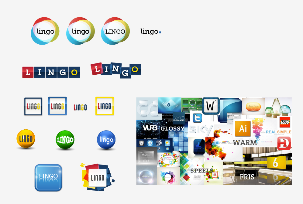
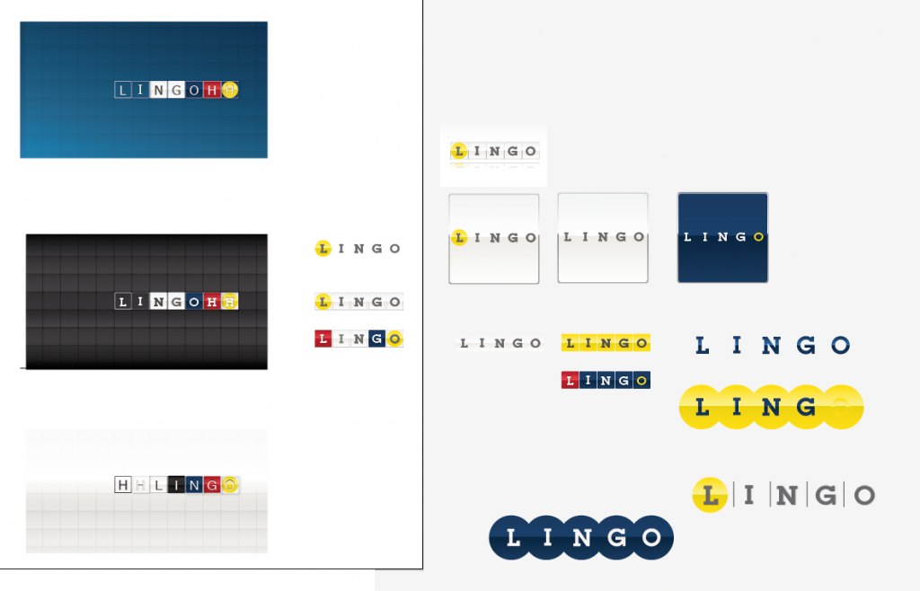
mijn eerste schetste die ik ongevraagd bij de offerte inleverde.
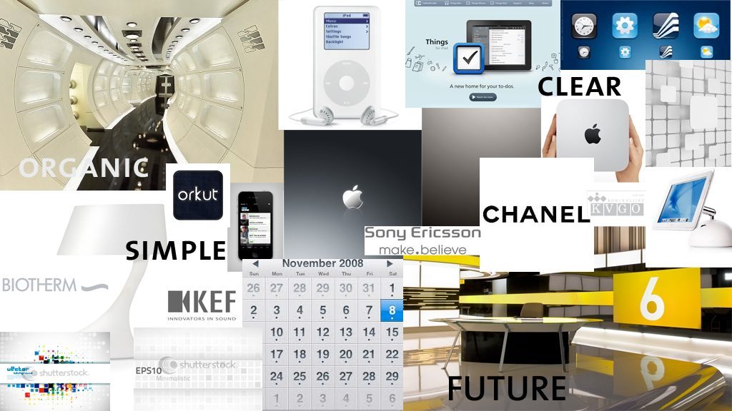
After the briefing I made 3 moodboards in which I tried to define 3 styles.
One of the things we talked about in the briefing was the apple style, which is fresh, modern and simple but still friendly.
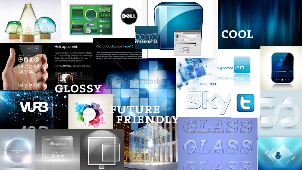
Looking at Apple things (and reading Steve Jobs Biography), it made me think of the little square with rounded corners that is used for apps. That would be a nice basis for the grid. free, modern but friendly. So I made another moodboard that emphasized the glass effect of those app buttons.
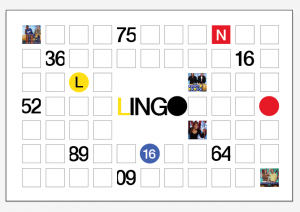
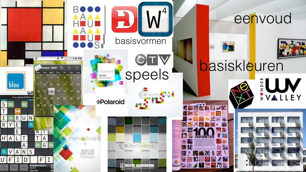
I made another moodboard that looked more like my first sketch and I called it bauhaus.
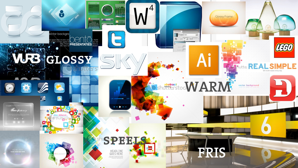
the comment on these moodboards was that it missed warmth. it was too technical.
So I made another one, along with some sketches.
Right away they liked a logo from the first sketches but I tried a few more.
