design process Een wereld op zee
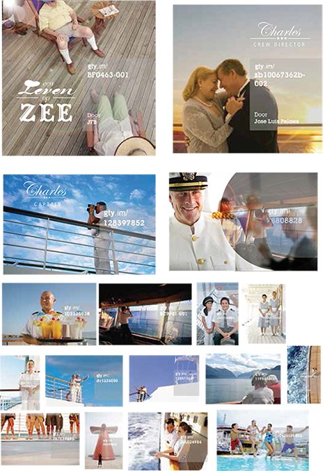
After the first briefing very early in the production, I made this list with possible shots. For me it works just like making a mood board; you are already setting a look and feel.
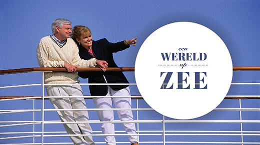
As you can see from the final leader, a lot of these shots were made and used.
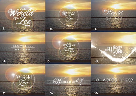
My initial title sketches were also used later to design the logo and titels. I started with the titles for some strange reason.
I love the see through effect but the client thought there was too much white space. With the type i was trying to make it look more serious, luxurious and sophisticated but client came back on my earlier sketches, with the more swirly and romantic fonts. So on designing I went…
I loved the font in logo 1 (La Portenia de la Boca) because it’s fun, not so stiff. But I thought the logo was not nautical enough. So I decided to jump on my bike and go to the harbour. Sure enough there were lots nautical fonts. Now combining it with the Copperplate made number 5.
After that I started on the editing of the leader. Choosing which shots to use was hard because they were all so nice. But I didn’t want to make the edit too fast either.
So here is version 5.
But I felt I could use more shots if I started moving things. And the client rightly pointed out that we needed more working people in the leader because that was what the show was all about.


