dagboek de nooijer design proces
172
page-template-default,page,page-id-172,bridge-core-3.0.9,qi-blocks-1.2.2,qodef-gutenberg--no-touch,qodef-qi--no-touch,qi-addons-for-elementor-1.6.3,qode-page-transition-enabled,ajax_fade,page_not_loaded,,paspartu_enabled,paspartu_on_top_fixed,paspartu_on_bottom_fixed,qode_popup_menu_text_scaledown,qode-theme-ver-29.7,qode-theme-bridge,disabled_footer_bottom,wpb-js-composer js-comp-ver-7.0,vc_responsive,elementor-default,elementor-kit-15687

dagboek de nooijer design proces
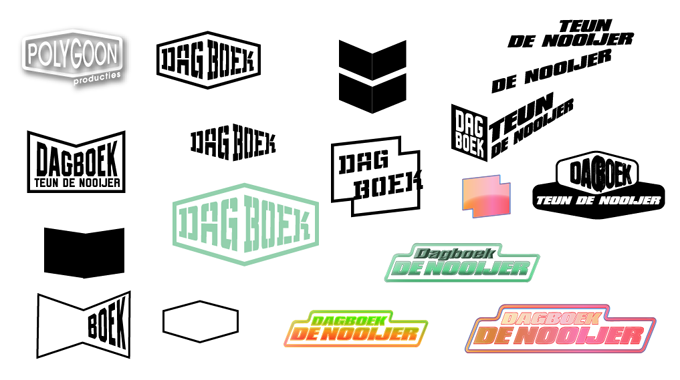
different sketches for the logo
I thought there might be more diaries from other sportsmen so I wanted to make is re-usable and emphasize on the diary. I was looking for a form that symbolized a book. But it didn’t have the fast feel to it, I was looking for. So I ended up with 2 blocks, but it looks nothing like a book.
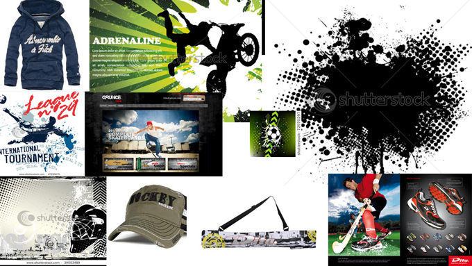
I gave the Telegraaf 2 moodboards with which we could go. One was more grunge, a more extreme and though sportive look.
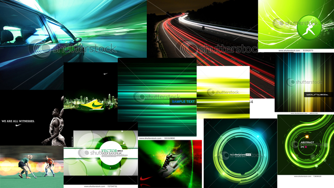
The other moodboard was also sportive but had the emphasizis on fastness and it looks more classy.


